Universal Windows Platform Application on Raspberry Pi

Universal Windows Platform (UWP) provides a common app platform on every device that runs Windows 10. The core APIs in UWP are the same on all Windows devices – including Desktop PC, Mobile Phone, XBox, Hololens, IOT devices and others

You can target specific device capabilities of a device family with extension SDKs, but you don’t have to do that if you are only using core APIs. Those core APIs include a very impressive set of UI capabilities. What that means is that you can create a UWP application using C# and XAML which will run on an ARM based processor on Raspberry Pi – because Windows 10 IOT Core runs on that.

Universal Windows Platform (UWP) has come a long way. I decided to dust off my good old Raspberry Pi 2B and take it for a spin last weekend.

The goal was simply to create a Hello World UWP application, deploy it on Windows 10 IOT running on Raspberry Pi (RPi), without using any device specific extension SDKs. Here is the stack – 

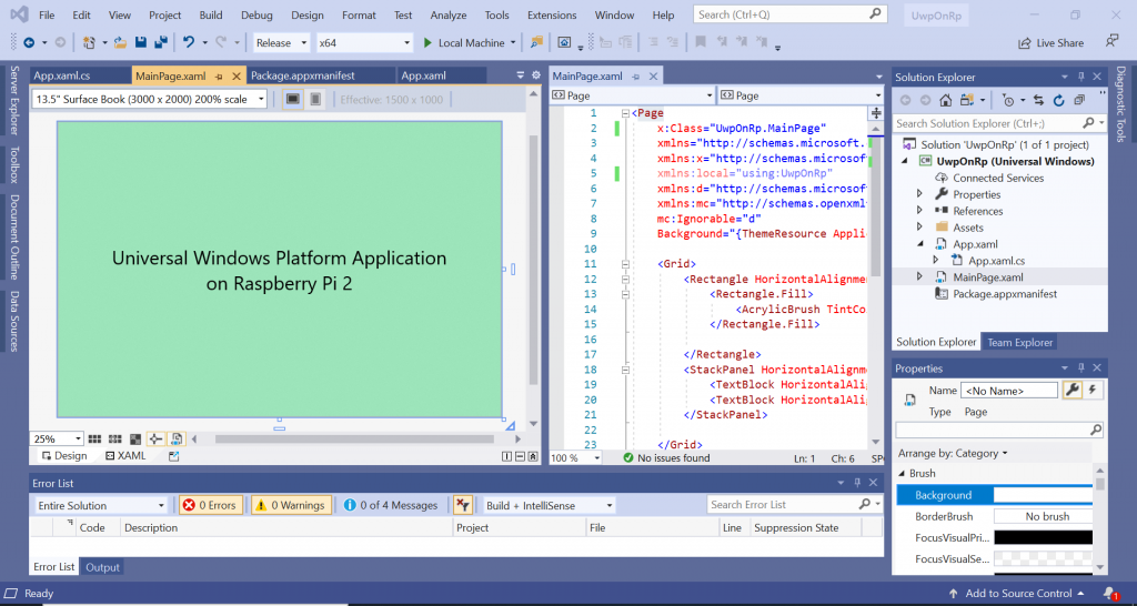
Create a simple UWP application in Visual Studio 2019. 

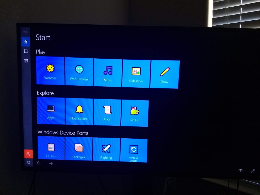
Install Windows 10 IOT Core on Raspberry Pi 2B and connect the device to a 50″ screen TV. 

Select ARM in the target platform drop down and Click on Remote Machine to Run/Debug Application on RPi device.

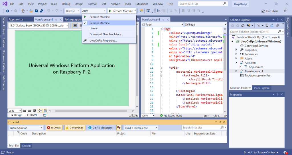
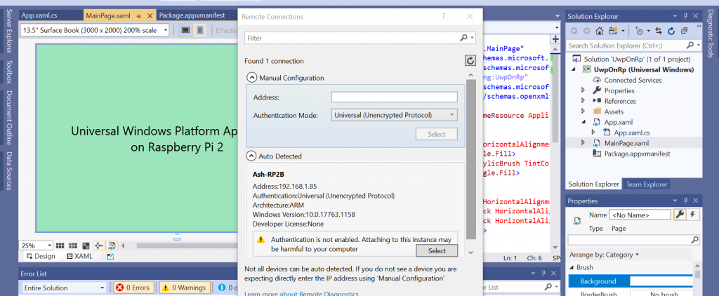
Select RPi device for deployment.

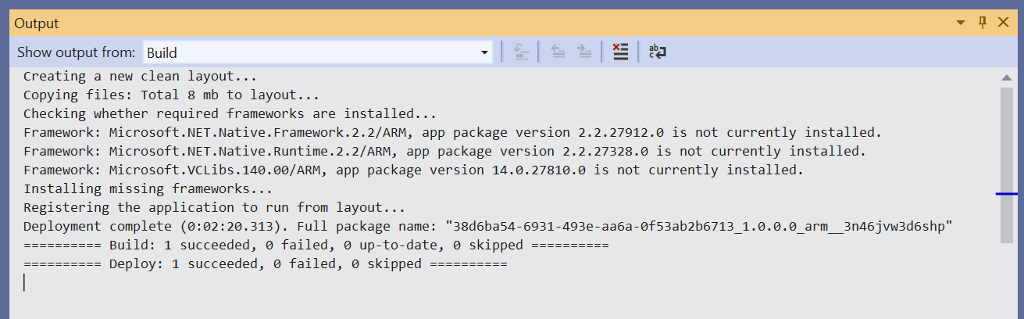
Deployment of UWP on RPi is complete. 

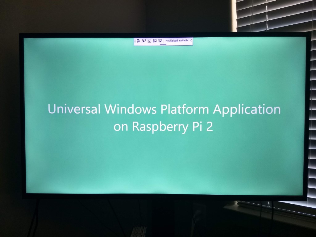
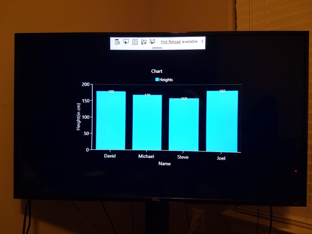
UWP application running on RPi. 

I updated the UWP application to include Syncfusion Chart control. Did you know that you can get a Community License for the entire product line (including Blazor, Xamarin and UWP controls) from Syncfusion?

UWP application is now running on RPi, attached to the Visual Studio debugger running on the development machine (Windows Surface). 

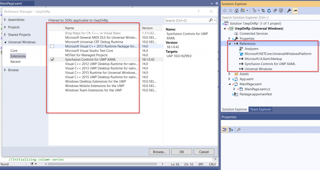
No device specific extension SDKs were referenced, just the core UWP APIs were used.

Code is on github.

Announcing CodeDemo

It is a challenge to use code snippets in presentations, demos and live coding sessions. I have struggled with this and seen many speakers jumping through hoops to assimilate code snippets in their demos. I had to create something to ease this pain.

Today, I am announcing the general availability of CodeDemo. A tool for instructors, presenters and speakers who create instructional demos, record screen-casts or do live presentations. CodeDemo pastes code snippets into your favorite IDE without getting in your way.

I decided not to open-source CodeDemo to challenge myself to an exercise in commercialization. I decided to learn about entrepreneurship, marketing, sales, licensing and other aspects of software commercialization. It has been an MBA’s worth of education so far. This journey is not over yet. I am taking the Lean approach of creating a Minimum Viable Product. The future of CodeDemo, its feature set and the price, will be shaped by the traction it gets in the market, the feedback from the customers as well as patterns of use reported by the users.

Head over to http://codedemo.net to grab a copy for yourself. Let me know if find it useful – I will be very excited to hear from you.

Here is a quick 2 minute introduction to CodeDemo :

[youtube]aFn3boBAWjw[/youtube]


Remove ListBoxItem Highlighting

A Silverlight/Wpf ListBoxItem is highlighted when selected or when the mouse hovers over it.

I need to display a list of items that are not highlighted when selected. This is a common scenario when displaying an inactive list for simply listing out some information.

ListBoxItem’s default template can be easily inspected and modified using Expression Blend – Select a ListBoxItem in Objects and Timeline pane, Right click and select Edit template > Edit a Copy. Name you template and save it at the scope of your choice.

This will create a copy of the template and allow you to modify it. Switch to the xaml view. Locate the VisualStates of MouseOver, Selected and Focused, and blank them out –

de-highlighted-xaml

The style is applied to the ListBoxItems using ItemContainerStyle –

applying-style-to-listboxitems

Here is the xaml style for the ListBoxItem –

After the style is applied, the ListBoxItems are not highlighted when selected or focused. Here is a live demo of a ListBox that does not highlight when items are selected : remove-listboxitem-hlighting-demo

Using Model-View-ViewModel in WPF Applications

I am presenting at SoCalCodeCamp this weekend (January 30th, 2010) – Advanced WPF – Using Model-View-ViewModel in WPF Applications.

tasklist-mockup
tasklist-mockup

Agenda :

1. Roles of the M-V-VM triad
2. Why use M-V-VM ?
3. Characteristics of the ViewModel
4. Build a Sample WPF Application using M-V-VM


Resources :

  1. MSDN Magazine Article and Sample Application Download
  2. Martin Fowler’s description of the ‘Presentation Model ‘
  3. Jeremy Miller’s ‘Build Your Own CAB’ series

Dial Gauge is a ProgressBar

I am not just being philosophical here. In WPF, ControlTemplates allow you to transform a control’s appearance. This is not the same as applying stylesheets. This is an entirely new level of customization. What you see in the screenshot below looks like a Dial but is actually a simple ProgressBar control wearing a “Dial” template. The Dial template was created using Microsoft Expression Blend .

dial-is-a-progressbar.PNG

Include the ControlTemplate as a Window.Resource and then assign it to ProgressBar element’s Template attribute :


Of course that is not all. The ControlTemplate must define some named elements of FrameworkElement type. Charles Petzold has explained it in detail : MSDN Magazine Article. So, I will not repeat it here.

The sample code can be downloaded here : DialTest.zip
License : Creative Commons Attribution-Noncommercial-Share Alike 3.0 United States License.

Using Custom Converter in XAML

In my previous post : WPF-LINQ To SQL Sample, I had to resort to modifying .dbml file to get the images stored as varbinary into the WPF ListView control. I had to change the Type of image fields to System.Byte[], instead of using System.Data.Linq.Binary. A better way to do this is to use a custom converter. WPF allows you to specify custom converter as part of the Binding in .xaml, like this –

<Image Grid.Row="2"
Source="{Binding Path=ThumbNailPhoto ,
Converter={StaticResource imageConverter}}"></Image>

The custom converter is declared in the same .xaml file as a resource –

<Window.Resources>
<local:ImageDataConverter x:Key="imageConverter" />
</Window.Resources>

ImageDataConverter is implemented in .xaml.cs file –

public class ImageDataConverter : IValueConverter
{
   public object Convert(object value, Type targetType, object parameter,
   System.Globalization.CultureInfo culture)
   {
      byte[] image = ((System.Data.Linq.Binary)value).ToArray();
      return image;
   }

   public object ConvertBack(object value, Type targetType, object parameter,
   System.Globalization.CultureInfo culture)
   {
      throw new NotSupportedException();
   }
}

The updated sample code can be downloaded here : WPF-LINQ to SQL Sample
License : Creative Commons Attribution-Noncommercial-Share Alike 3.0 United States License.